Aaron Burnett is an experienced writer and communicator with a passion for political critique and policy analysis. He sought my help to develop the visual side of his brand.
PROJECT Branding
TIME 3 months
TOOLS
Pencil & Paper
Illustrator
Google Docs
PROCESS
Research and Design
Feedback and Revise
Finalize
Throughout the design process, Aaron and I explored various directions for his logo. After several revisions, I designed a logo that defined his profession upon first glance but still had a touch of his personal flair.
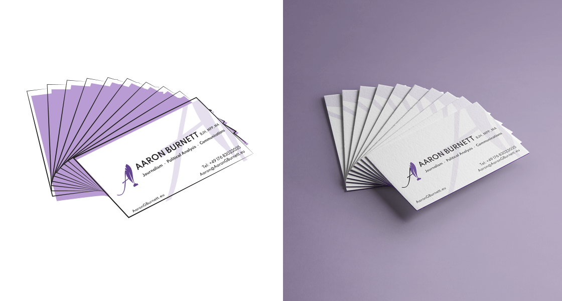
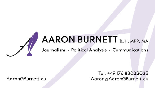
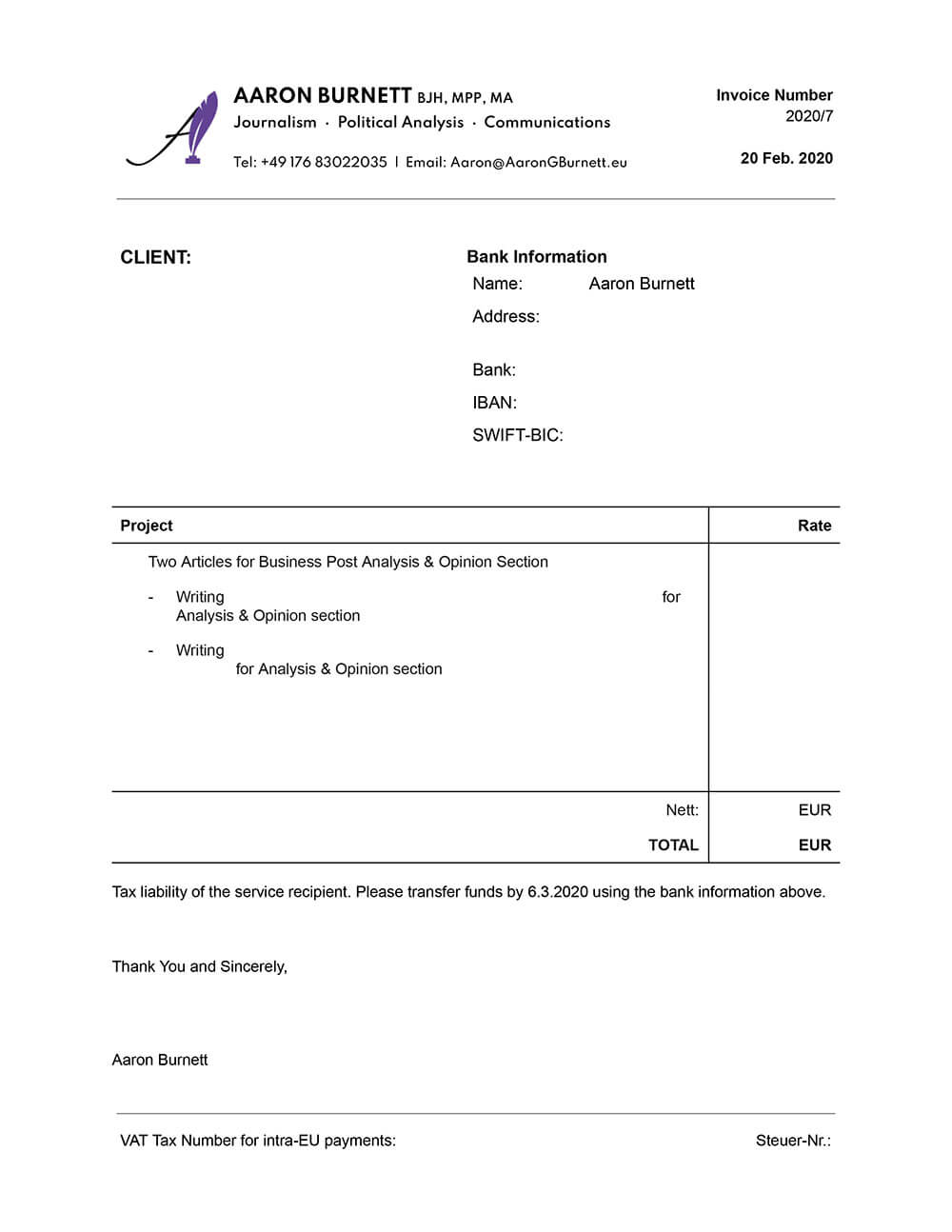
Aside from the logo design, I also designed a business card, revised his invoice template, and consulted on his website development.
Research and Design
In my initial consultation with Aaron, I asked about his writing and design preferences to get a sense of his style. I also briefly interviewed our mutual friend, who had referred him to me, to see if he had additional insights. From these talks, I made some quick notes to hopefully guide the design:
some opinion writing
some sarcasm with idealism
corporate-ish with a worldly view
bold; opinion about everything
purple
I struggled with where to begin, even with the notes, so I researched imagery and icons related to news, writing, and journalism. I also looked up logos for news publications in Germany (where the client is located) for added inspiration.
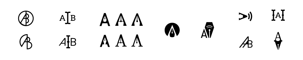
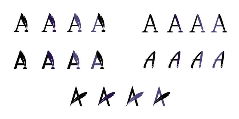
Focusing on certain symbols such as a pen/pencil, a loud speaker, and a text cursor along with his initials, I sketched some initial designs. To add visual appeal, I experimented using various Gestalt principles such a figure/ground and symmetry.
For the initial samples, I provided the client with 5 different designs, and asked him to choose the one that grabbed his attention. I then worked on additional variations based on his selection to further determine a design direction.
Feedback and Revise
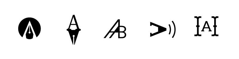
Out of the initial designs, Aaron chose the second logo (with the pen nib ‘shadow’). While reviewing the first round of design revisions of this choice, he sent a new logo idea for me to use as inspiration for another design direction. The second round of revisions incorporated a quill and fountain pen with the initial “A,’ and the use of purple within the designs.
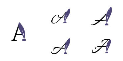
After selecting a design from these options, the third round of revisions focused on testing several script fonts instead of a serif or sans-serif font.
Finalize
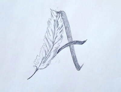
After the third round of revisions, Aaron knew the direction he wanted to take for his logo. Refinement was the goal of the fourth revision. Since Aaron wasn’t satisfied with the original look of the font’s letter A, I provided two variations reducing the curl of long stroke.
With Aaron finally happy with the foundational design of his logo, I provided him with color options that would work on light and dark backgrounds.
Additional Materials
After finishing the logo design, Aaron also wanted a business card design and updated invoice template. I used the same process for these documents as I did with the logo design – design, get feedback, and revise. Content layout was the key to creating an uncluttered design that is easy to read and understand.