Beyou is a new health bar in the UK aimed at ‘millennial women on the move.’ They’re looking to build their quirky brand into something fashionable, approachable, and aspirational that will pique the interest of young women.
PROJECT Branding
TIME 4 Days
TOOLS
Illustrator
Photoshop
Pencil and paper
PROCESS
Research
Define
Design
Lately, I’ve been exploring creative briefs focused on food. This project required several deliverables for a marketing strategy to garner interest from social influencers to further grow the brand. With a timeline of 4 days, I developed the tagline, designed the packaging, and created various advertisements.
Research and Brainstorming
Before beginning my research, I took note of various keywords, phrases, and design requirements provided in the brief. I also did some research on millennial fashion and other health bars in the market to see how I could build the brand to be a disruptive change for the health food market.
Keywords & Phrases:
active, vibrant, fun, social
exciting & disruptive
quirky
fashionable
aspirational
approachable
Design Elements:
bright colors
expressive patterns
bold typography
clear brand messaging
Key Competitor Characteristics:
large, sans-serif fonts
photos of product or ingredients
lots of text
I also conducted quick and informal interviews with 3-5 women within their target audience to understand what they’re looking for when purchasing health bars, and what attracts their eye when faced with so many different designs of packaging. From these interviews, I discovered that most of the women preferred quality imagery and minimalist designs, but primarily purchased based on their nutritional needs (e.g. low sugar, high protein, etc.).
Defining the Brand
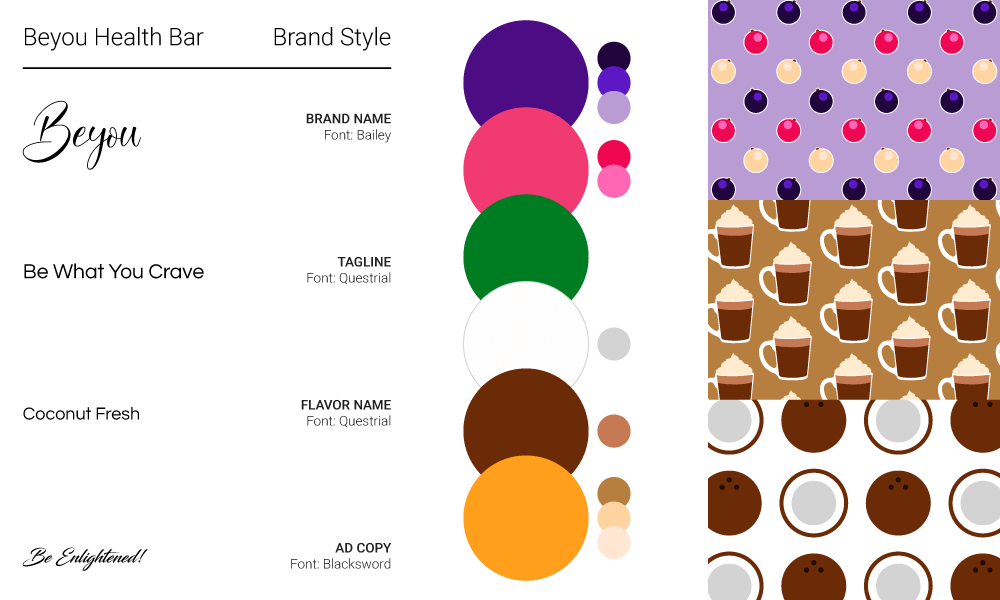
I based the color scheme on the three initial flavors that would be marketed – berry, coconut, and mocha. The saturated colors accompanied by some of their tints and shades provided a range of colors to create interesting patterns to match the brand’s fun and quirky personality.
For a different take on the typical fonts used, I chose a calligraphic font to emphasize the brand’s name and message to their audience of “be you.” In contrast to the brand name, a medium-stroked san-serif font is used to clearly convey all other information.
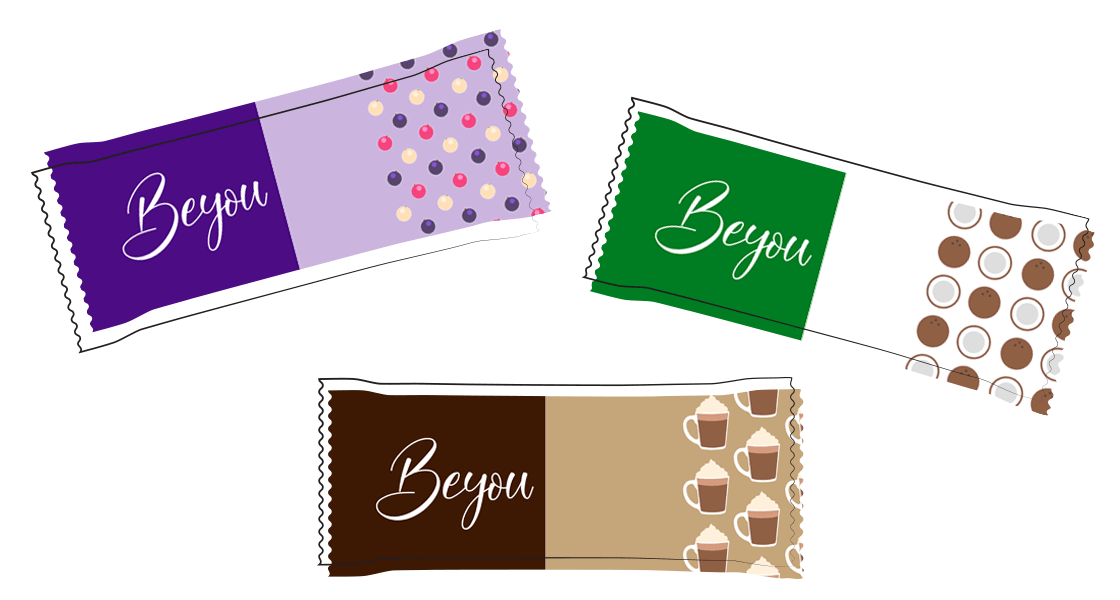
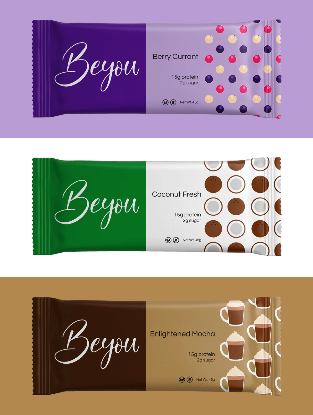
Product Packaging
Taking into account the feedback from my informal interviews and market research, I paired high contrasting color combinations with fun patterns to accentuate each flavor and create a minimalist design.
For customers concerned with allergies, dietary restrictions, or nutritional content, I included sugar and protein values along with vegan and gluten-free icons to be easily spotted on the front of the packaging.
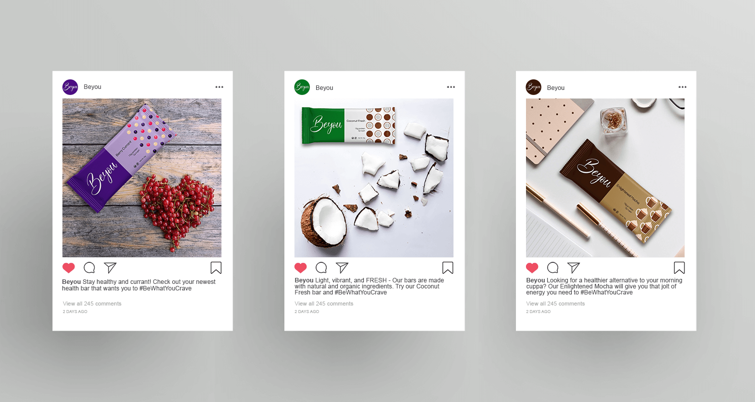
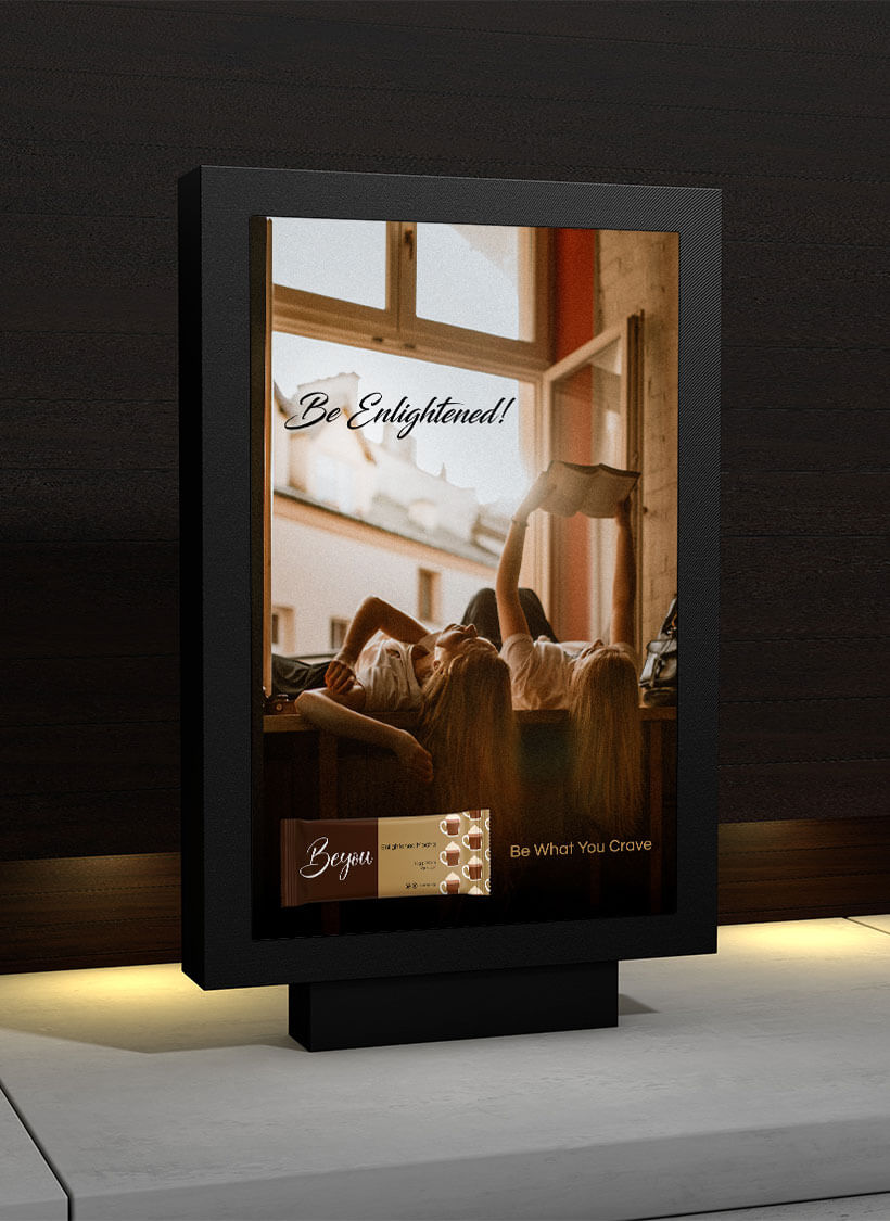
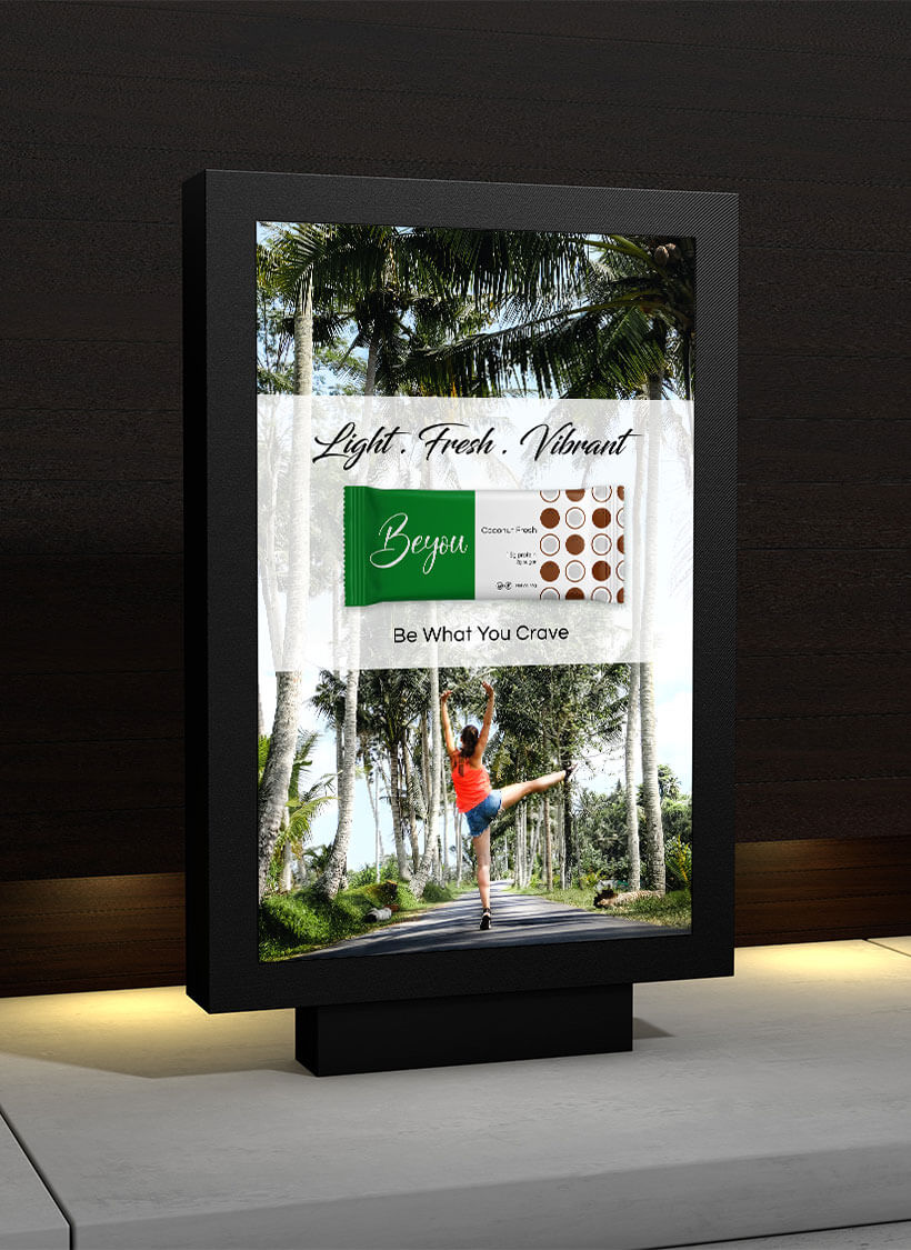
Advertisements
With the brand’s aim to be a “fashion item” that’s shareable and likeable, social media advertisements were a must to boost the initial launch.
With the underlying message of being healthy, each advertisement and its copy had a slightly different approach – a fun play on a word, focus on no artificial ingredients, and a better food alternative.
In addition to the social media advertisements, I designed two billboard ads that focused more on the lifestyle aspect of the product.
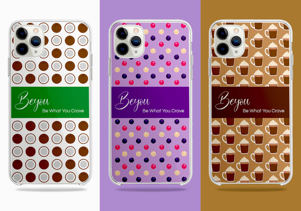
Merchandise
For those that really resonate with the brand and its message, I designed iPhone covers to express their love for their favorite flavor.