Omni Cheer Sublimation Administration Interface
Omni Cheer is an online retailer of cheerleading and sports apparel with sublimated clothing being their most customizable and highly profitable product offering. As the primary admin that maintained the sublimation designer tool, I always dreaded working with the outdated interface because of its limitations. I decided to redesign it to provide a better user experience for both new and advanced users.
PROJECT
UX/UI
TIME
3 months
TOOLS
- Pencil & Paper
- Illustrator
- InVision Studio
PROCESS
- Empathize
- Define
- Ideate
- Prototype
CHALLENGE
Redesign the backend interface for the customization tool to improve user efficiency and simplify maintenance workflows.
GOALS
- Introduce functionality to improve user workflows
- Add visual cues to create intuitive design
- Update interface to match company brand
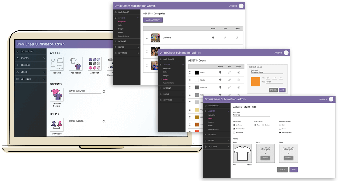
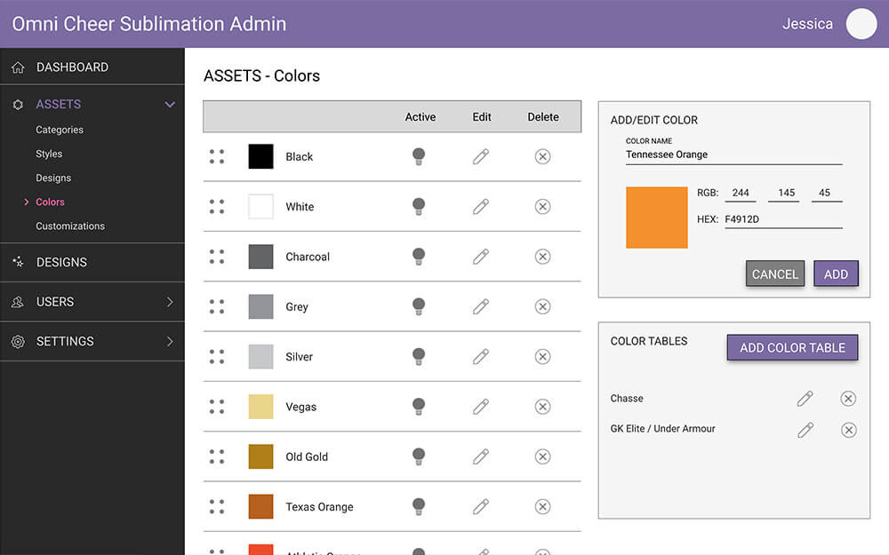
NOTE: Since the dashboard has 4 major areas (Assets, Designs, Users, and Settings), I focused on the Assets area where majority of the administration update/maintenance processes are performed. For this phase of the redesign, I targeted the least complicated sub-sections: Categories, Colors, and Styles.
Understanding the Users
There are two main categories of users for the interface – novice and experienced.
Being an experienced user and having to maintain the interface since its development, I learned how inefficient and time consuming it was to complete tasks with how the system was designed. Over time, I developed and documented my processes so that novice users wouldn’t have to spend so much time with trial and error to understand what functions were available. Although the documentation is helpful with understanding how to work with the interface, users still encountered numerous pain points.
Defining the problem
Admin users need to speed up and improve their update and maintenance processes because it would free up time for other work and allow new admins to easily understand and navigate the interface to complete tasks.
How might we improve the interface to be easier to use?
After determining the problem and researching other systems, I sketched wireframes that incorporated improvements to various landing pages. These solutions would be the most impactful implemented across several areas.
- Drag-and-drop for file upload and sorting
- Better use of horizontal/white space
- Update look and feel to match redesigned site
- Incorporate icons/graphics for visual cues
Sketches of initial screens for the Login, Categories, Styles, and Colors pages.
Creating the prototype
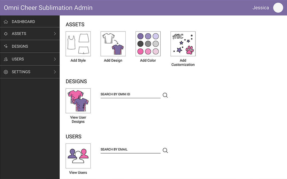
The original dashboard was empty. Adding quick links to common processes reduces the number of clicks for users to complete their tasks.
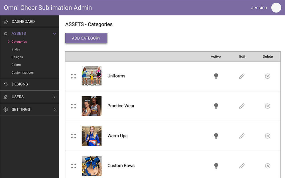
Icons replace text links for actions such as activate/deactivate, edit, and delete. Drag-and-drop functionality is integrated for list sorting.
Since the interface would not be accessed by mobile, horizontal space was used for relevant content/tasks and to reduce scrolling.
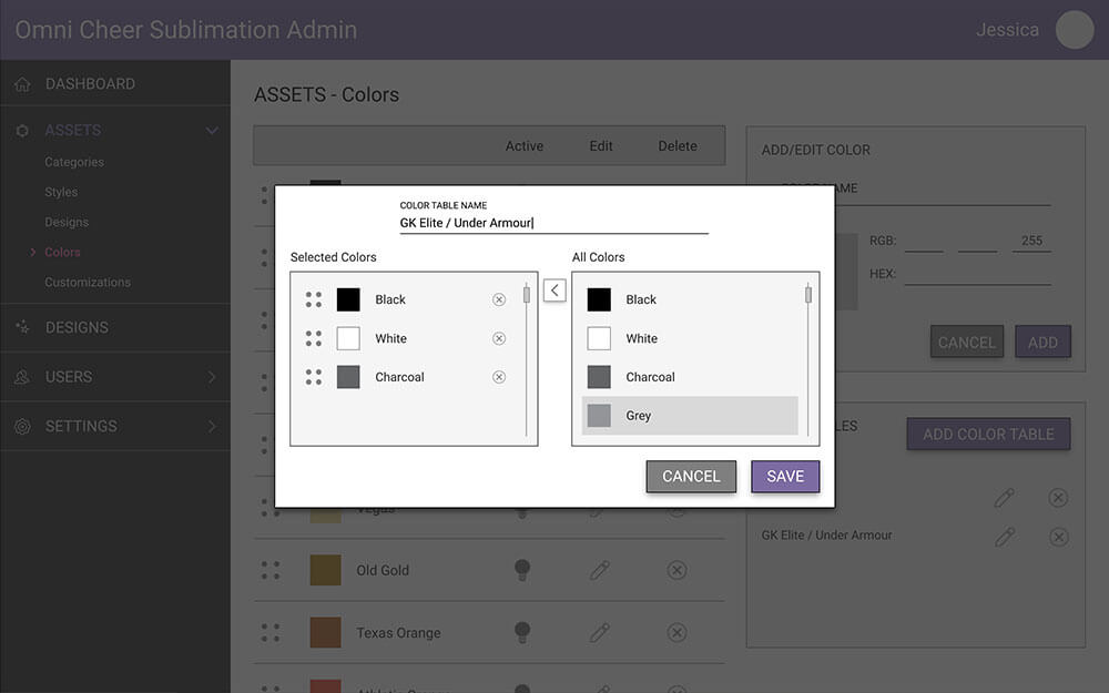
Overlays cut down on screen changes, and help users keep track of what section they’re working on.
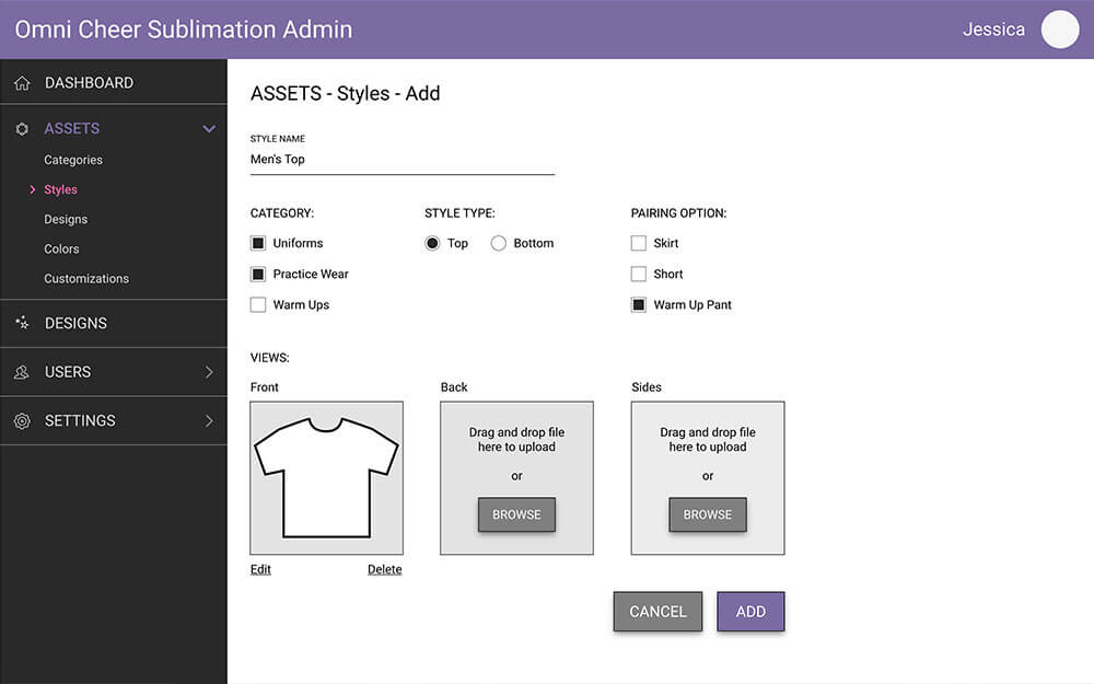
More options, such as adding categories and pairings, streamline the process when adding new styles.
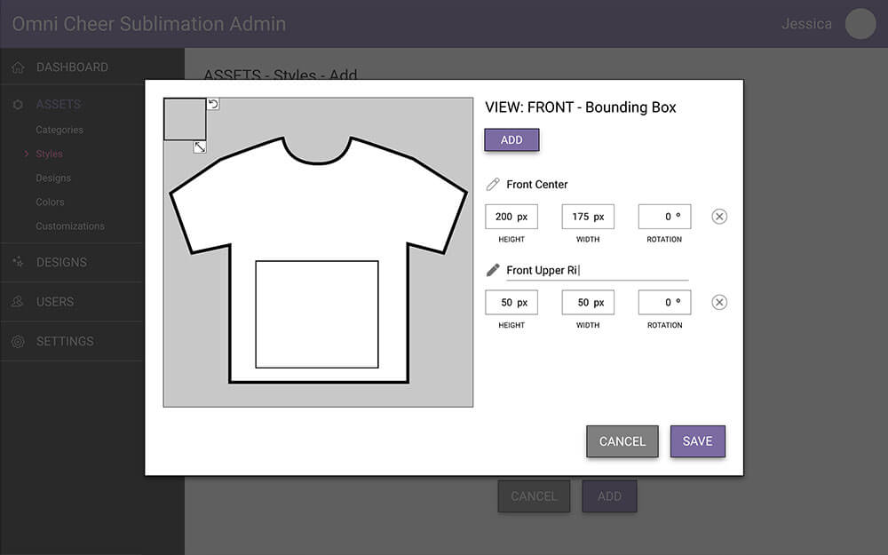
Bounding boxes now have interactive tools to resize and rotate instead of inputting numerical values.
Conclusions
Working on this project, I became more aware of how intuitive design helps to refine user processes. Some of the solutions I brainstormed even came from everyday interactions with email, creative software, and video games.
I especially enjoyed reimagining this interface because I worked with it for over 3 years. Even though I became efficient working through its limitations within my own workflows, I would have liked to see if my suggested enhancements actually helped.