ZUNO Fruit Teas
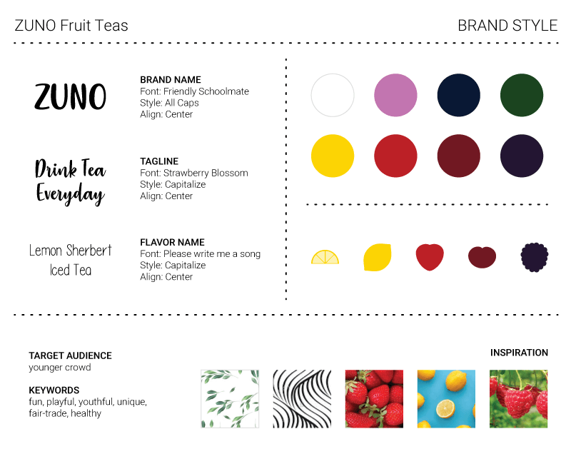
ZUNO Fruit Teas offer a variety of unique, fair trade fruit tea blends from across the globe. To break the perception that tea is meant for an older crowd, they’re looking to develop a fun, playful, and youthful brand identity to attract a younger audience.
PROJECT
Branding
TIME
3 Days
TOOLS
- Illustrator
- Photoshop
PROCESS
- Research
- Define
- Design
I wanted to work on more projects based around food, and found this creative brief with a short timeline. It included specific guidelines such as no photography on the packaging and exploring playful patterns or illustrations. I haven’t worked with pattern designs for awhile, but really enjoyed creating some for this project.
Research and Brainstorming
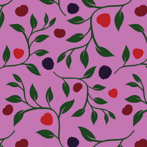
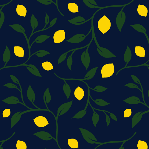
To help spark inspiration, I began by looking up photos of fruits and leaves. These images led me to think of organic objects and shapes such as curves and water (an important part of tea making). I explored patterns with wavy lines and blue hues, but ended up incorporating tea leaves in vine-like shapes.
Defining the Brand
With the simple message of ‘drink tea everyday,’ the style’s direction followed the same route with flat icons and illustrations that used solid colors and uncomplicated shapes. Playfulness was expressed through handwritten fonts and emphasized by high contrast and vibrant colors to inject energy.
Package and Merchandise Design
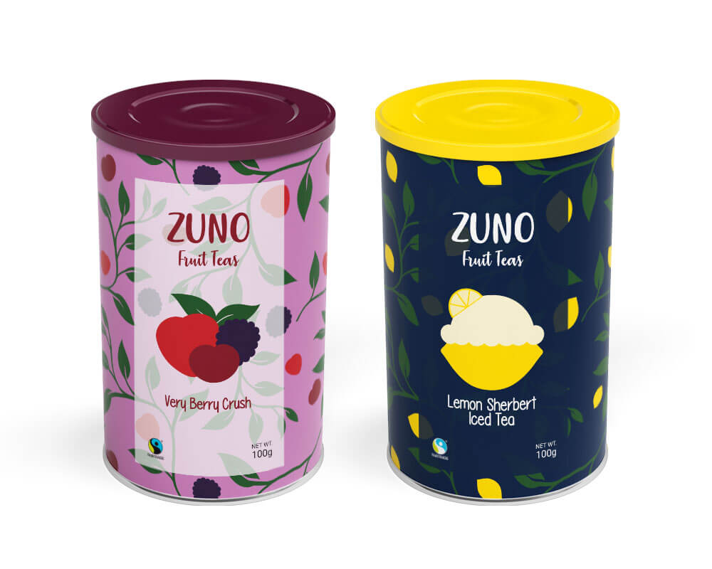
After creating the core illustrations, I experimented with various compositions for the label designs. I wanted to make it easy for people to identify the flavors just by looking at the images.
Initially, there were five different berries for Very Berry Crush, but the combination of colors and graphics competed with the background pattern. Reducing the number of fruit to three and using analogous colors created a more cohesive design.
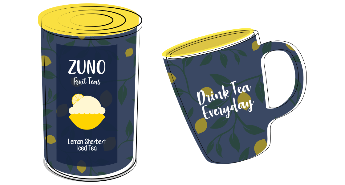
The design for Lemon Sherbert Iced Tea is clearly all about lemon. However, I realized that it’s not just lemon-flavored but sherbert too. This obviously made me think of ice cream, so the iconic scoop of ice cream found its way on top of a lemon.
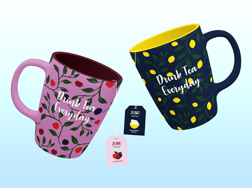
An additional requirement for the brief was to design some branded merchandise. I found this to be a great way to incorporate the brand tagline ‘Drink Tea Everyday.’
